Name: Coorg Kannada Family
Designer: Ramakrishna Saiteja
Foundry: Indian Type Foundry
Release Date: Pending
Back Story:
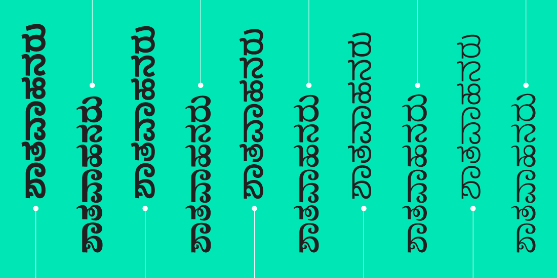
23-year-old Saiteja of Bangalore, India, is this year’s Society of Typographic Aficionados Catalyst Award winner, in recognition of his significant achievement and future promise in the field of typography. His elegant design for the Coorg Kannada type family makes reading Indian-language newspapers more of a joy and less of a struggle. Kannada is a Dravidian language spoken by 50.8 million people in southern India. Its written form derives from a 5th century script, Kadamba, and can be a bit tricky for type designers: it has an inherently wide proportion, and an atypical reverse stress when compared with Latin type. Some forms fall below the baseline as subscripts to indicate added sounds. As if this wasn’t challenging enough, the height added to each character by the subscripts forces fewer lines per page.
Saiteja first began working on Coorg Kannada in early 2016 because he found the typefaces in local Kannada newspapers lacking. “The fonts used in most newspapers are poorly designed for text due to an unresolved and uneven texture, and don’t enhance the reading experience in any way,” Saiteja says. Guided and advised by his colleague, Satya Rajpurohit (one of ITF’s founders, along with Peter Bil’ak) he perfected and refined the design and followed up with Coorg Kannada Sans as a more neutral variant of the typeface.
Why’s it called Coorg Kannada?
The Coorg language, which uses Kannada script as a writing system, is widely spoken by the people of Kodava, India, and the type family is named in their honor.
What are its distinguishing characteristics?
Designed to maximize legibility, the Coorg Kannada family’s letterforms in both Classic and Sans follow the proportions of Kannada and are balanced so that they work well together. Certain characters bear stylized terminals plus angled head strokes and ink traps where needed. The subscripts are matched in terms of weight and gray value with the main characters, with a careful eye towards creating an even texture on the page. It adds up to a well thought out, visually coherent type system.
What should I use it for?
Coorg Kannada shines for setting text in any medium. It has five weights unlike previously available Kannada fonts, providing options for a wide range of text hierarchy within the same typeface. The heavier weights of both styles are intended to be used for display purposes.
What other typefaces do you like to pair it with?
The Classic Kannada sits well alongside ITF Gujarati in terms of Indic scripts. William Text is a good Latin typeface match. As for the Sans, try it with sturdy Equitan or Neutral.
source: http://www.eyeondesign.aiga.org / AGA Eye on Design / Home> Type Tuesday / by Angele Riechers / June 20th, 2017

